Enterprise Design System Documentation
Building a comprehensive design system and documentation platform that scales across multiple products, teams, and platforms while maintaining consistency and accessibility standards.
Role
Lead Design System Architect
Timeline
12 months
Platform
Web
Stakeholder Research
We conducted extensive interviews with designers, engineers, product managers, and accessibility specialists to understand their needs and pain points.
We needed a centralized design system that could serve as the single source of truth while remaining flexible enough to accommodate diverse product needs without becoming a bottleneck to innovation.
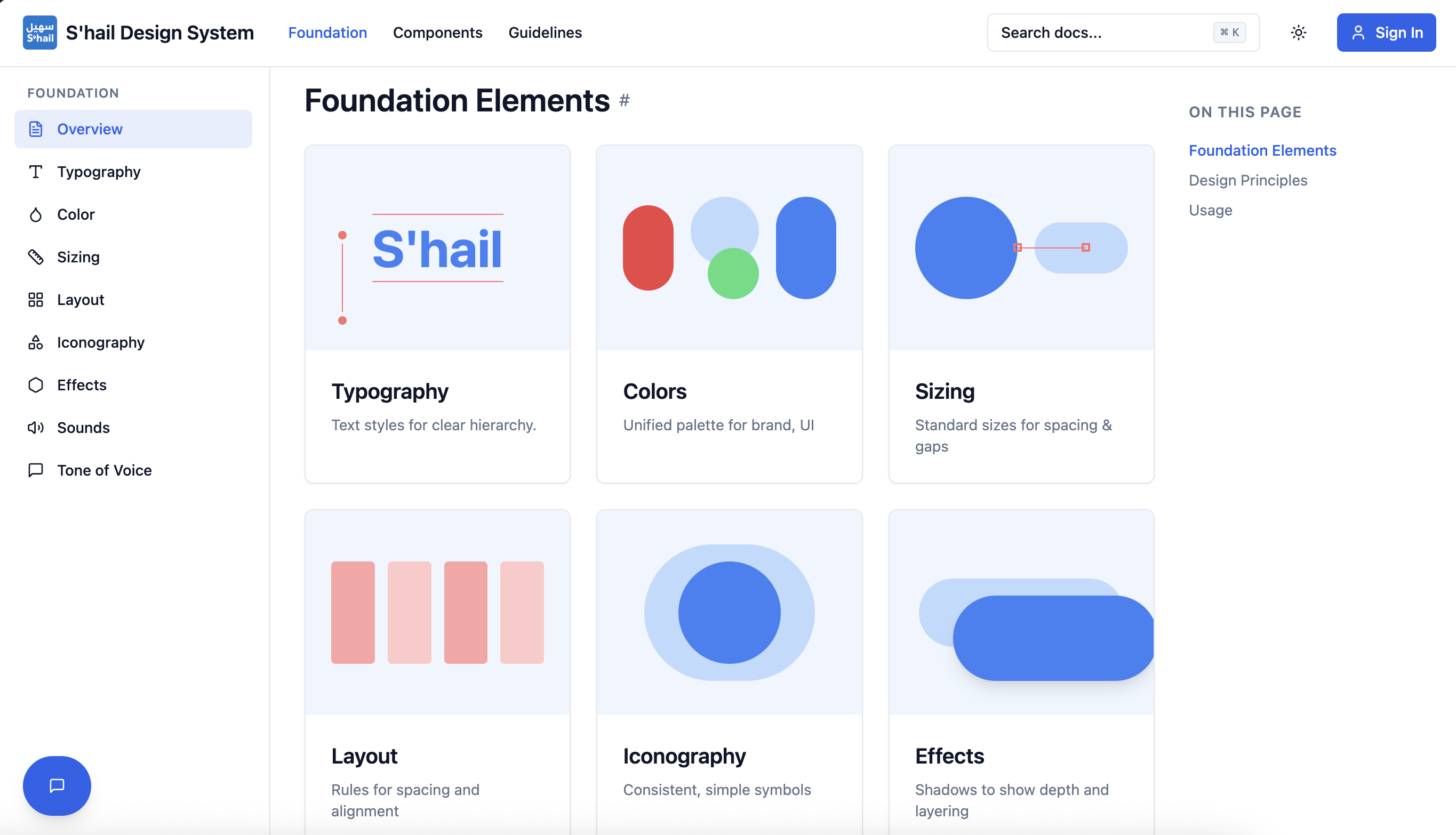
System Architecture
We structured the design system into four foundational layers, each building upon the previous to create a scalable and maintainable system.
Design Tokens
Colors, typography, spacing, and primitives that form the foundation
Core Components
Buttons, inputs, cards, and atomic building blocks
Patterns
Common compositions like forms, modals, and navigation
Guidelines
Accessibility, content, and best practice documentation
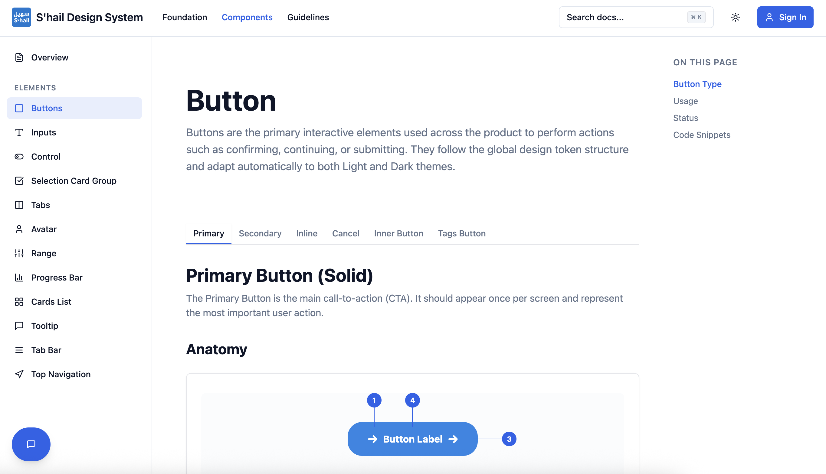
Component Library
A comprehensive library of 60+ accessible components with live examples, API documentation, and usage guidelines.
Interactive Examples
Live component playground with real-time prop editing
Code Snippets
Copy-paste ready examples in React, Vue, and native mobile
Accessibility First
WCAG 2.1 AA compliant with keyboard navigation support
Documentation Platform
Smart Search
Instant component discovery with fuzzy search, filters, and AI-powered suggestions
Live Code Playground
Interactive code editor with real-time preview and automatic prop controls
Theme Switcher
Preview components in light, dark, and custom themes with one click
Version History
Track component changes, view changelog, and compare versions side-by-side
Key Learnings
Building a design system is as much about organizational change as it is about technical implementation. Success requires continuous advocacy, education, and demonstrating clear value to stakeholders.
Documentation quality directly correlates with adoption rate. Teams won't use components they don't understand, no matter how well-designed. Investing heavily in clear examples, migration guides, and interactive demos was crucial to our success.
Starting with design tokens rather than components allowed us to maintain flexibility while ensuring consistency. Teams could extend the system for unique needs without breaking the foundational design language.